(The place not the insult as to be accurate)
All of my main artwork. If I post something here, it isn't because I have to, but because I want to. This is a timeline of WIP or "Finished" work.
Saturday, November 12, 2016
Tuesday, November 1, 2016
Saturday, October 8, 2016
A FINDRs Phi
follow the tumblr here:
Alright- I've moved the who shabang to tumblr too!
Go ahead and inbox me there if you have any questions about the comic or characters so far.
and I'll likely answer them using a specific character!
I'll be updating tumblr and blogger for the future so there's
no need to worry about missing anything coming up.
Thursday, October 6, 2016
Inktober!!
I'm using the standard prompt for Inktober this year and have followed every day so far! I'm posting all of my images for Inktober this year on my Instagram, but I may just dump my week of inks each week here!
If you want to see all of my Inktober drawings as they come up just follow me @thatoneguywithstuff93 on Instagram!
Otherwise, give me til the end of the week and I'll show you what I've got so far.
Tuesday, September 20, 2016
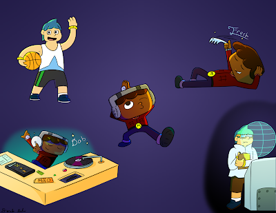
character poses 2
Hey! Just doing another round of character poses in
my down time. Seems like lighting works best when
using negative and complementary colors. Though
That could be stylistic.
And don't worry about the comic- I didn't
forget! Just taking a breather is all!
Wednesday, September 14, 2016
Tuesday, September 13, 2016
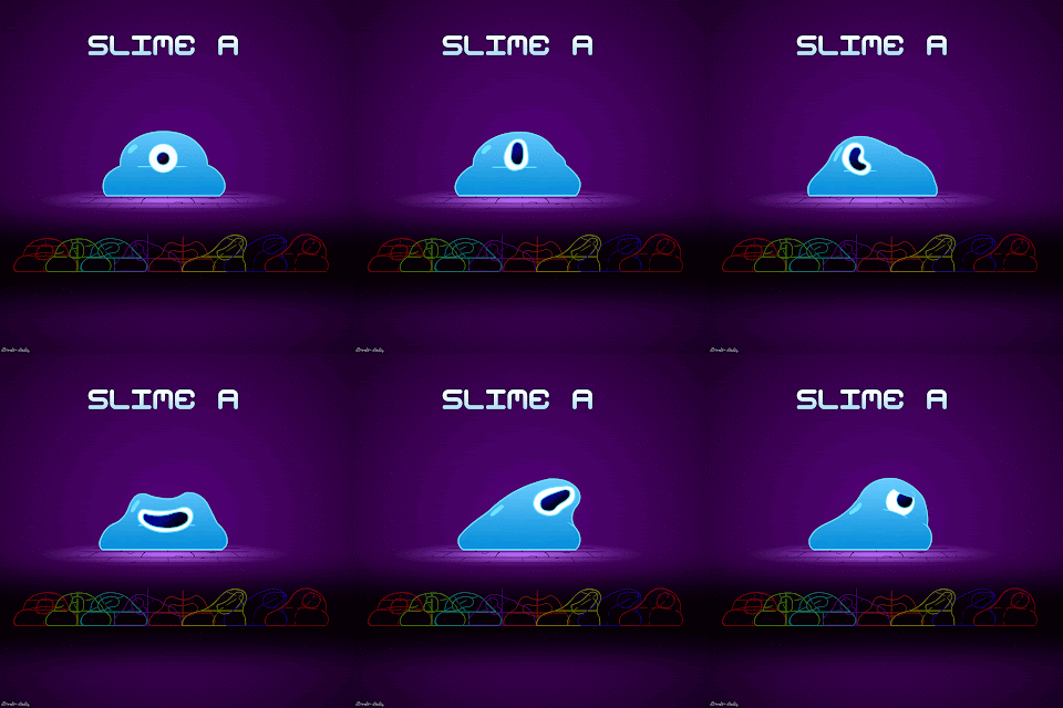
Slime A
Hey, guys. I'm getting back into animating
(among other things) so that I don't lose my touch.
I did this little gif in the span of... 4 hours?
Anyway, really happy with how this came out.
And remember- squash and stretch is important!
Saturday, September 10, 2016
Characters!
It's been quite some time since I've added any art
just to have art! Glad I made time to get stuff
like this together and keep practicing poses!
Thursday, September 1, 2016
Monday, August 29, 2016
RP: Poses and perspective
I feel like it's been a while since I uploaded any character
artwork that I just felt like doing, so here's a random
idea I had a while ago.
Honestly, I had many sketches, but you have to cut out any poses
you don't agree with... or just fix them. Either way. But this
was more of a pose and perspective practice for me than anything else.
But who knows? Maybe I'll do something for Rocket here down the line!
Monday, August 22, 2016
Tuesday, August 2, 2016
Friday, July 22, 2016
Tuesday, July 12, 2016
Group Photo
To celebrate my return from hiatus, I did a quick doodle of
the FINDRs crew! But what IS FINDR? And
are they competent? We'll just have to wait and see.
Saturday, June 18, 2016
Friend ship
I really question the connections between
my own characters before realizing what's what.
Tuesday, May 31, 2016
Saturday, May 21, 2016
Fun... with Fire!
Today, I'm gonna teach you guys how to make fire- digitally.
In Photoshop. A way that's safe for the environment. Maybe.
First, start with a sketch of the fire itself. A big area
for the center and a longer area for the trails.
Note: Lighting anything the fire may interact with is pretty important,
but I've already covered lighting many times!
Next, color in your area with a base color on a normal layer.
Easy, peezy right?
On a new Layer, draw some lines for the stream in a complementary color
to the first one you started with. I started with orange and added a
yellow to orange gradient here. Set this layer to linear dodge. Then,
copy this new layer and make it slightly larger and transparent if wanted.
As many times as you feel neccessary-you'll probably see
the fire unfolding by now!
So, go back to that base color layer, copy it, and make that an overlay
layer above all of the other layers I'll even list. Also copy the
complementary color layer you made before (the first one) and
make that an overlay as well to really push out that condensed fire feeling!
If your fire isn't condensed, you can probably skip this! :P
Now, copy to bigger complementary color layer and make that one a
dissolve layer just above that one. The same with the original as well.
Make any last minute changes to the bg as well- I added orange tints to
my character's lighting so it looks like it effects him. Though I purposefully
left out an actual outer glow, that can be done with the gradient tool if you
actually want to do so yourself. But that's it!
Also, if this character looks familiar it's because it's a redisign of a
previously existing character I designed a while ago!
Wednesday, May 11, 2016
Super Inferior and Superior
I've actually been really busy with my web comic
in the midst of Finals- Master's division! If anyone
wants to see how THAT's been going...
Monday, February 1, 2016
Aries Knight
Hey, it's been a while, but I finally have a reliable tablet, and a new piece!
This one I drew a bit differently, sketching as many times as needed
to get the right design I had in mind. Proportions are a bit
easier now that I have a directional guide line drawn in
the earlier stages.
Once my sketches are done and my idea is solid, I outline
once in red and then again in the actual outline color,
to make sure I have it just how I want it. I even
previewed my lighting idea somewhat.
When it came down to coloring, I'd seen an Aries-themed color scheme
and decided to run with it since that's my zodiac thing! Also, by this time
I actually decided on where the sun would be and drew a little
indicator to keep in mind before I start lighting.
Once the highlights and shadows were where I wanted them, I'd added textures
to the different parts of the armor while keeping distance and mind. Then, further
implemented a newer technique I picked up during my down time.
Coloring the lines, shadows and highlights really makes things pop
when done correctly! I've recolored this guy a few times because of it!
And to be honest, all of the zodiac color schemes were great
so I might do a piece for each of them.
As far as Superior Alpha Bomb goes, I still want to finish it!
I haven't given up hope!
Just give me a little more time and I'll post
some pages. Thanks for sticking with me, everyone!
Subscribe to:
Comments (Atom)


