Wednesday, September 30, 2015

High hopes


Oh man, have I been busy! I'm finished with school and am
now looking forward to whatever comes next. That, however,
has nothing to do with this. I just wanted to try this style out.


For those of you who don't know, there's a rule of thirds that
comes into designing... pretty much everything. The
red lines help me graph my page so that I can be sure
it follows well while I color.


For shading, it's best to stay away from black. Same
goes for lighting and white. Just use complementary
colors and contrasts for a real popping sensation.
Then set it to multiply because it looks weird.


This is trickier. The same rules I just explained before
are done here but in a smaller, more tedious fashion. You
just have to feel out where which color goes (its best
to look at the light source for what goes where).
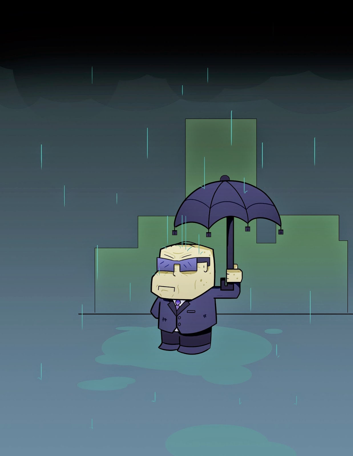
Also, cloud. Enjoy.


Then I threw on some home-made lense flare, added
a light gradient over the whole thing and some text
and viola! The whole thing!

Lastly, the comic is kinda on hiatus for a bit while
I look for another tablet. Having graduated from school
I don't have access to the best of tech at the moment.
That may change in 2 weeks, but we'll see!

Friday, July 17, 2015

The Battle


This is a pretty intense scene that I couldn't help but finish and share.

The outline I had was pretty rough. And I wasn't
entirely sold on the idea of an eye... cannon... thing.

Once I started the actual linework I noticed
that the creature is a blob, and as such cannot have
black outlines (unless it was tar)
Once I did the linework I kinda knew that red was going to be the theme
color of this piece so I complemented it as best I could.


The glowing effects from the lava slime was essential.
It helps sell the hopeless look on the young hero's face.
Heh...

And then I added some color passes under a soft light
layer just to make it all pop just a little more!
I hope this guy lives.... but maybe not.

Tuesday, July 14, 2015

Rolling Hills Animation


I just realized I never uploaded the video of
the Rolling hills for you all to see!
Well, this is it basically! I had to butcher
this character's color for now and there's no sound.
Still, I'm happy with how this came out.

Monday, July 13, 2015

Aegis Canyon


Trying to get back into the swing of backgrounds!


So, I started with some cylinders (simple shapes
are working better for me).


Then I took my time and detailed everything I saw
along my vanishing point.


I don't intend on keeping the outlines, but
I needed to go over the base sketch again
to make sure I want to keep it all. Adding at least
this base white color  helps me layer each part
of the piece in place.


After removing the lines I don't want, I blend
the lines I kept into the now added color and gradients
by makling it a soft light and viola! The
yellowest canyon road you'll ever see!

Friday, May 22, 2015

Rolling Hills background


This is the next [piece I've decided to animate.


I always start with a rough, general idea
for how I want this to end.


And then ed up with something like this after
outlines, adding texture effect and all that jazz.
I'm not going to show my entire process
this time, as I'm going to animate this scene!
There's a lot of parts to move, and I
assume when I'm done I'll post it here.

Wednesday, April 15, 2015

Green Forest


Finishing old sketches I had centuries ago (not really).
This is something like practice so I don't lose
my style.


This was the sketch. It's actually about
a semester or two old, really. And yes,
the sword is actually supposed to be that big.


Then the outlines. I decided to keep
the bird there against my
better judgement.


Added a few accent lines so hat there
is a texture to the things that need it.


The hard part was color surprisingly. I only
wanted varying types of green, yellow-green and blue-green
(this does include the sword), and it couldn't blend in. So it took 
a while to get this exactly like I wanted.


And then I topped it all off with some tonal swipes
with a paint brush tool. For depth reasons.

Monday, April 13, 2015

Mondays Old Guy


Last quarter took up so much time I had nearly zero time for personal projects, 
which was no good.
So hopefully this grumpy title card makes up for it.


I had a sketch at the end of the quarter that I couldn't work on
until this quarter started so I decided to work on it.


Stuck to the basics, outline is first for my style.


I added the color and water from my drawing and noticed
how bland the background was and threw a 
bleak city in the background. I pushed the age
in his features with age lines, too!


Then I added some color to the background and thought "this is good"...


... but barring it off will make it look better! 
Less space means more tension and in this case I'd
say it works better this way.


Then I figure I'd title it and call it a day. The title was
a lot lower, but it blended too much, what with 
all the blue... everywhere. So, enjoy.

Friday, February 6, 2015

Underwater


I've been REALLY busy this quarter with animations- 
so much that I've had to halt my personal projects 
(thoughI did manage to finish one of them). 
But in my workings I learned the awesomeness of ocean 
colors and decided to do a few backgrounds for it.


Lighting helps to establish a time of day,
especially underwater where there's no sky.


Icy hues may suggests seasonal changes as well!

I may do an ocean animation if I get time off
at some point (so never, basically).

Saturday, January 24, 2015

The bus ride project


I COULD be working on still art at the moment, but I'm
working on an animation at the moment, so, yeah.
My time's devoted to this guy at the moment.

Monday, January 19, 2015

The DJ Pad


This one took a little longer than the others,
but it was worth it to get that "string bean"
limb kinda style!


As usual, I started out with my initial paper sketch...


Then I began the line work.
I jumped the gun on the colors so I can get
a feel for how I want the room.


Then I dropped the base colors on everything and
removed the outlines (because I REALLY like it this way),
but that wall corner stayed to show the bridge
between the far and left wall


Whilst the wall thing worked, it being the only line made it
stand out too much, so I added detail lines to everything
to show what texture was what.


And as a final tough added lighting.
By the way, I'm getting into the stringy limb thing a lot so
I may pick this up once I finish my current animation.

Friday, January 16, 2015

Redisign #2


I was having so much fun over the break redesigning some characters
I even went back and redesigned my first one... again! Really
liking the lineless look so far, but I'll see how long that lasts.

Wednesday, January 14, 2015

Sub-main character


Welp, I finished a second one and realized: these two
would go great on the same page! So I spliced
them together. They are the same character, but
at two separate points in my cruel, cruel plot system.

Monday, January 12, 2015

Character stuff


Welp, it's been almost a month, but it's back to work now.
Even though I was technically on a break, I did a lot
of character design sketch work over December. I may finish all
of them, but I had to finish this guy first! He's a redesign of
a prior character I'd made about a year ago!